One of my least-favorite, yet highly-used, apps is AMC Theatre’s app for finding movie show times and purchasing tickets. The app is highly-used because I watch a lot of movies in the summer. It is my least favorite app because it is not well-designed.
From my perspective the app should help solve a few basic problems for a moviegoer:
- Identify which movies are currently playing, or being released soon
- Identify when/where current releases are playing
- Facilitate the purchase of seats for current/upcoming releases
The app actually succeeds at solving problems 1 and 2 (despite high load times). The app even lets me buy movie tickets. My biggest issue is with the post-purchase experience.
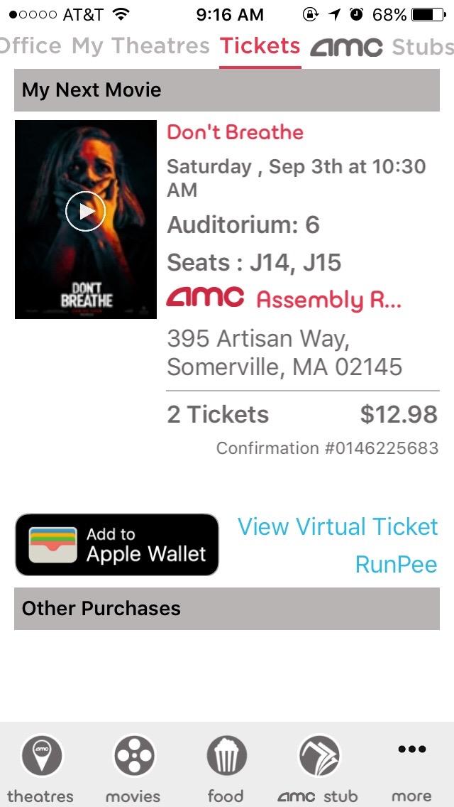
After purchasing tickets, the app gives me three options for retrieving the virtual ticket, a QR code that needs to be presented for admission:
- Add the ticket to Apple Wallet.
- Send an SMS, with a link to the QR code, to your phone.
- Use the QR code displayed at the end of the checkout process.
Option 1 is the most convenient for me as an iOS user. Option 2 works, but is silly given that I have the app. I suspect this option is the result of using a WebView that is shared with the desktop web experience. As a user of the mobile app, Option 3 is ideal. However, Option 3 disappears if you navigate away from the post-checkout view (or restart the app). This is where the problems arise. It is not obvious how to view your virtual ticket if you navigate away from this view.
Sadly, it’s taken me all summer to discover that there is, in fact a method of retrieving my recently-purchased tickets. How? You need to be on the home view, which displays a navigation bar at the top of the screen. The two ways to get there are to either (a) restart the app or (b) go through a sub-menu on the tab bar at the bottom of the screen.
Let’s dig into what’s going on here.
The app clearly doesn’t follow the iOS Human Interface Guidelines. Yes, they are guidelines; but, if you are going to ignore them, doing so should lead to an improved experience. Examining the screenshot above, you’ll see that the home view has a tab bar at the top (where a navigation bar belongs) and a tab bar at the bottom.
The tab bar at the top is problematic for a few reasons, the first of which is the fact that it is in the wrong location. In addition to being in the wrong location, it only appears in this view. Nowhere else does that bar appear and, as mentioned previously, this view is not easy to navigate to. Finally, this tab bar is redundant:
- The “Box Office” tab is variation on the “movies” tab in the bottom bar. (The “movies” view does not include the full-width banner.)
- The “My Theatres” tab links to the same view as the “theatres” tab in the bottom bar.
- Both “AMC Stubs” tabs link to the same view.
The biggest offense is the fact that the “Tickets” tab is only visible if you have an upcoming showtime. How can I, as a user, expect to ever find my virtual tickets if they only appear under a tab that is not always visible on a page that is not normally navigable!?
The second point of tab bar guidelines addresses this issue directly:
Don’t remove or disable a tab when its function is unavailable. If tabs are available in some cases but not in others, your app’s interface becomes unstable and unpredictable. Ensure that all tabs are always enabled, and explain why a tab’s content is unavailable. For example, if there are no songs on an iOS device, the My Music tab in the Music app explains how to download songs.
To recap, the app features the “Home” view that is not easily accessible, features a redundant tab bar, and said tab bar includes a disappearing tab.
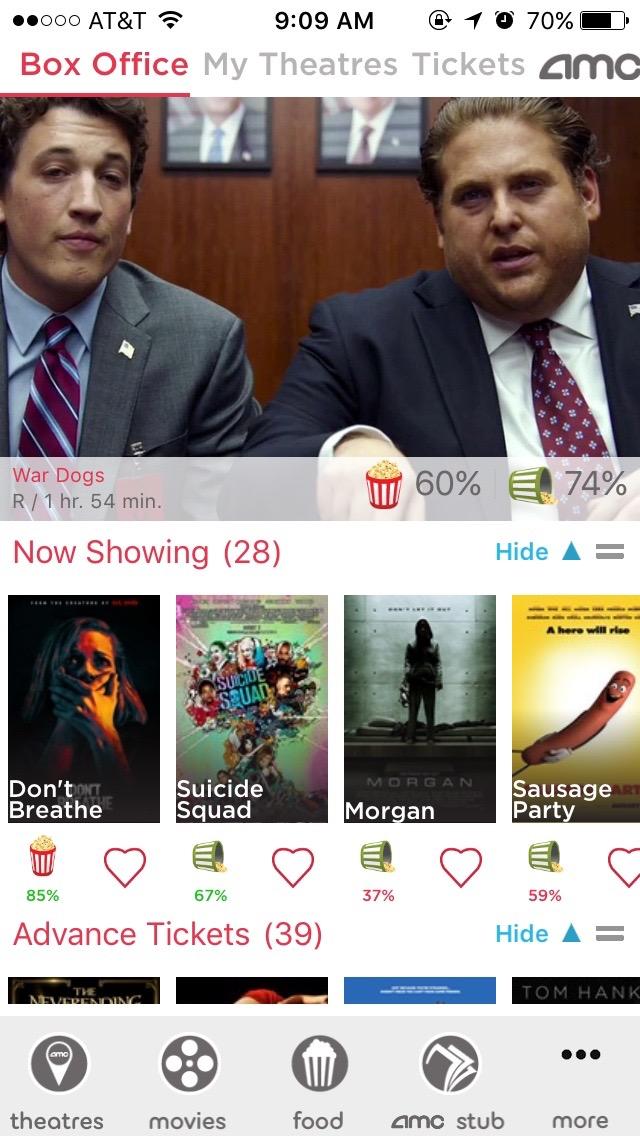
Let’s move beyond that view, and look at the main tab bar at the bottom of the app. Here is the introductory paragraph for the iOS guidelines on tab bars:
A tab bar appears at the bottom of an app screen and provides the ability to quickly switch between different sections of an app. Tab bars are translucent, may have a background tint, maintain the same height in all screen orientations, and are hidden when a keyboard is displayed. A tab bar may contain any number of tabs, but the number of visible tabs varies based on the device size and orientation. If some tabs can’t be displayed due to limited horizontal space, the final visible tab becomes a More tab, which reveals the additional tabs in a list on a separate screen.
The AMC Theatres app’s tab bar adheres to much of this guideline, but fails to provide a tab for one of its primary functions: ticketing. Clearly the view exists, given that we can navigate to it via the home view. Adding a link should be relatively simple.
There are numerous other issues with the app (especially with its responsiveness to user actions), but the inability to easily view virtual tickets is the worst. How can AMC fix these issues?
- Ditch the home view. It is redundant, and its additional tab bar is an anti-pattern.
- Make “Tickets” a top-level menu item. If it cannot replace an existing default item (e.g. “Food”, which I never use), add it to the “More” sub-menu.
- Make the application more responsive. Viewing details for a movie (on a fast Wi-Fi connection) requires about 5 seconds for page loads.
- If a virtual ticket is intended to truly replace a physical ticket, the virtual ticket needs to have the same information. Specifically, the Apple Wallet tickets should include the seat number. It’s rather strange to have someone scan my ticket, direct me to the appropriate auditorium, and neither party know where I am seated. Determining this usually requires digging into email or the app, somewhat defeating the purpose of adding the ticket to Apple Wallet.

Clearly someone at AMC cared enough to create an app. I just hope they care enough to perfect it.