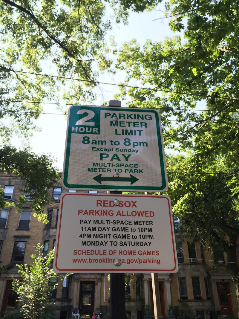
My earlier post seems to have gained a wider audience beyond my own submission on reddit. The comments have been rather interesting, and I write now to address a few of them and expound a bit more on my suggestion to change the sign (shown below with a new, daytime, photo).
Let’s get a few minor items out of the way:
- Yes, the sign reads “Red Sox parking allowed” (not available as I originally posted). Regardless, my original statements about the vagueness of the sign stand.
- Yes, one can easily determine if there is a home game by simply looking at the stadium lights. That is still no excuse for a 4MB PDF download. The root problem, however, was not downloading the schedule, but knowing that I needed the schedule in the first place (and subsequently needed to pay the meter).
- Just because you have lived in Brookline for years and experienced issues with Red Sox parking doesn’t mean I should be able to decipher a poorly designed sign.
- No, I am not advocating for the removal of Red Sox parking. I live in Cambridge and have never had to deal with Red Sox parking. Sorry, Brookline residents, you’ll have to find another standard-bearer.
To reiterate, my initial proposal was that
RED SOX PARKING ALLOWED
be changed to
PAYMENT REQUIRED NIGHT OF RED SOX HOME GAMES
One reddit commenter noted the portion of the sign stating “pay multi-space meter” indicates that one should pay the meter. His/her argument is that, had I completely read the sign, I would have known to pay. I understand that argument, and I counter that the ambiguity of the “Red Sox parking allowed” heading leads readers not interested in the Red Sox game to ignore the rest of the sign. In fact, the heading is so confusing that the sign is more useful without it. Imagine the sign were changed to the text below:
PAY MULTI-SPACE METER 8AM DAY GAME to 10PM 6PM NIGHT GAME to 10PM MONDAY TO SATURDAY SCHEDULE OF HOME GAMES www.brooklinema.gov/parking
Simply removing the ambiguous heading makes the sign much clearer because it now gives a clear, explicit, directive: pay multi-space meter. This sign would make the viewer pause to determine if he needs to pay the meter. We can go further with this. A few commenters who are Brookline residents and/or frequent parkers in the area stated that they normally rely on the meter to determine if they need to pay. According to them, the meter will refuse payment if payment is not required. ErnieAdams states that, “it’s best practice to just walk over to the meter and read what it has to say.” The problem with this is that it is not “best practice” for everyone. Multi-space meters (as opposed to individual meters per parking space) are fairly new to me and to the areas of the Boston metroplex I frequent. I have only ever seen them on Newbury Street in Boston and at public lots in Cambridge. However, let’s assume ErnieAdams is correct and the meters do refuse payment (I haven’t confirmed if this is true). The sign could be reduced to:
PAY MULTI-SPACE METER
Again, we have a clear, explicit directive that leaves no room for confusion. I make no claims to be a great designer or information theorist; but, I do know a subpar design when I see one. This sign is subpar. If you think about nearly every other traffic sign/indicator, nearly all of them are clear, explicit, and devoid of confusion. In some cases, the very shape and color (e.g. red octagon with white outline means stop) is enough to relay the necessary information. There is no excuse for a parking sign to be any less clear.